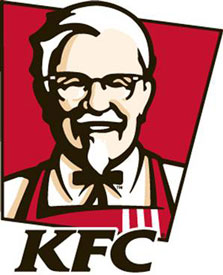
In early November KFC introduced a new symbol for only the fourth time in it's 50-year history. In this new iteration the colonel sheds his suit for an apron. Many folks that I discussed this with don't really understand the change. Most folks believe the colonel was only a figurehead for the company when, in fact, he developed the recipe and often spent time in the kitchen. Harland Sanders owned a service station where he developed his famous recipe of fried chicken, first serving folks food from his living room. His reputation grew until he could own his own restaurant, where he was the chef, and developed his unique method of cooking chicken using a pressure cooker. Also not readily known is that he did this at the age of 40 after being a firefighter, a steamboat captain and a salesman. His familiar white outfit was adopted after he was made an honorary colonel by the governor of Kentucky as a means of self-promotion.
In my opinion this change is the greatest change to the image of KFC since they changed their name from Kentucky Fried Chicken to KFC to fend off concerns of excess fat content. The significance of this change is that the recipe used today is still the same recipe designed by Mr. Sanders himself, that he was an authentic chef and a culinary visionary.
This is exactly what a brand is meant to do--—evolve, redefine, and support customer loyalty. Brands are defined by what customers believe and feel in their hearts, not what the corporation or a marketing departments say. I do believe and predict that KFCs stock wil rise due to this image change. Why? It brings convenience and honesty home. People who love KFC love it because it's easy, fast, and very reasonably priced. Those are exactly the values that the Colonel was trying to do. I see this change as more of a true-to-image change than anything else. KFC lovers know it in their hearts that it's a great product, now the symbol has evolved to show that.
The colonel would be proud.